SPACE BETWEEN SPACE WITHIN
Exhibition Branding & Catalogue
2016
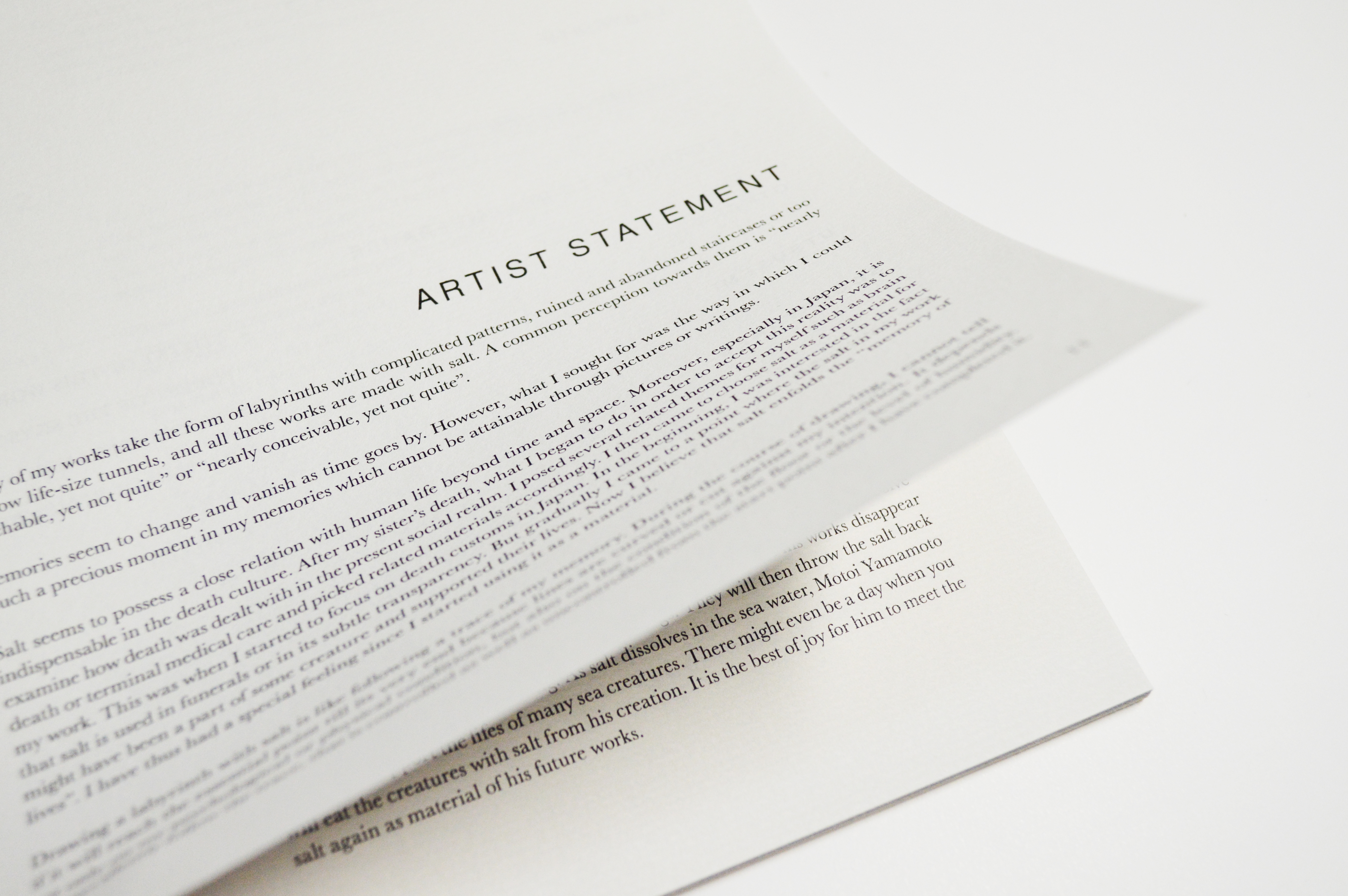
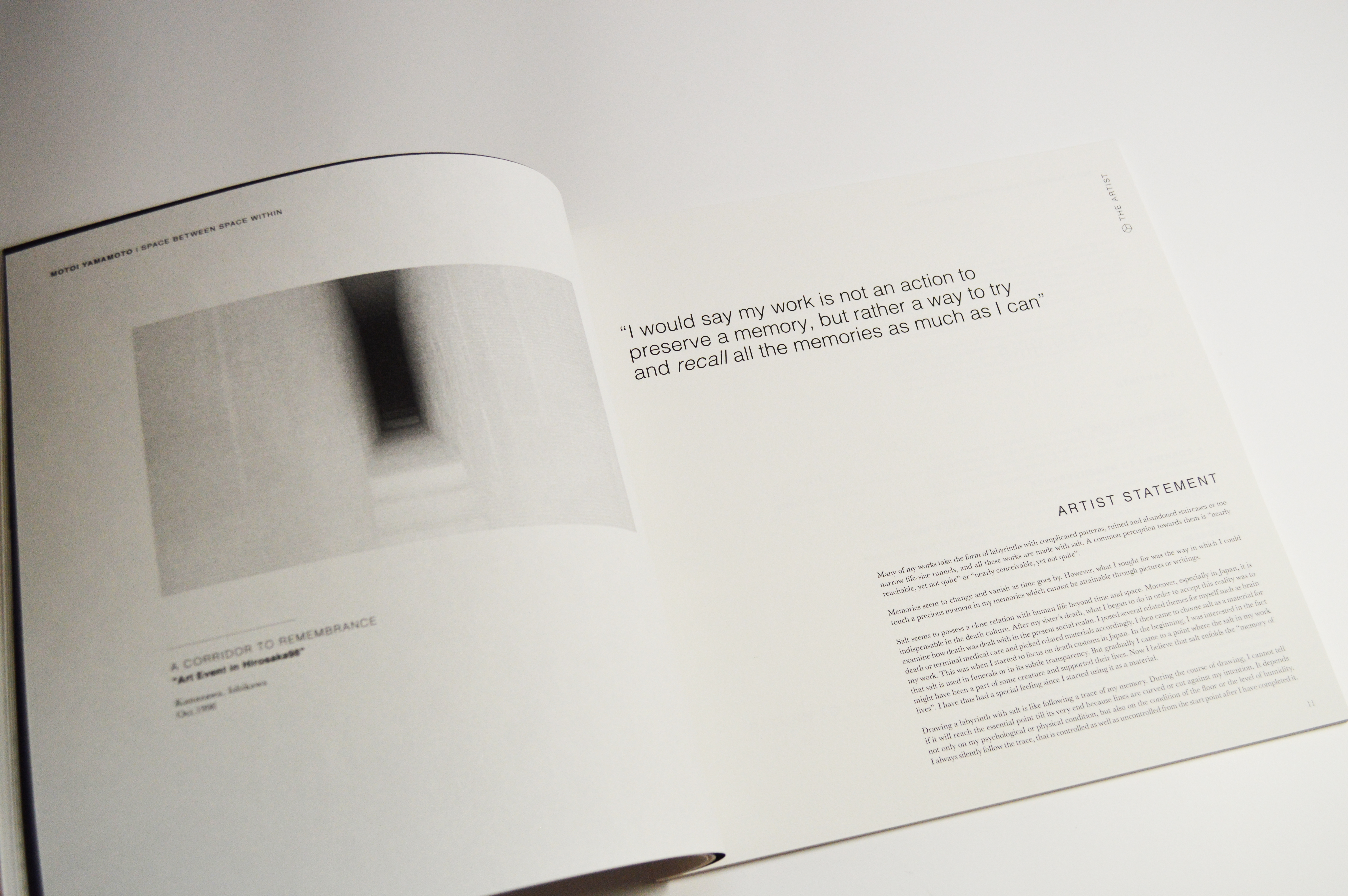
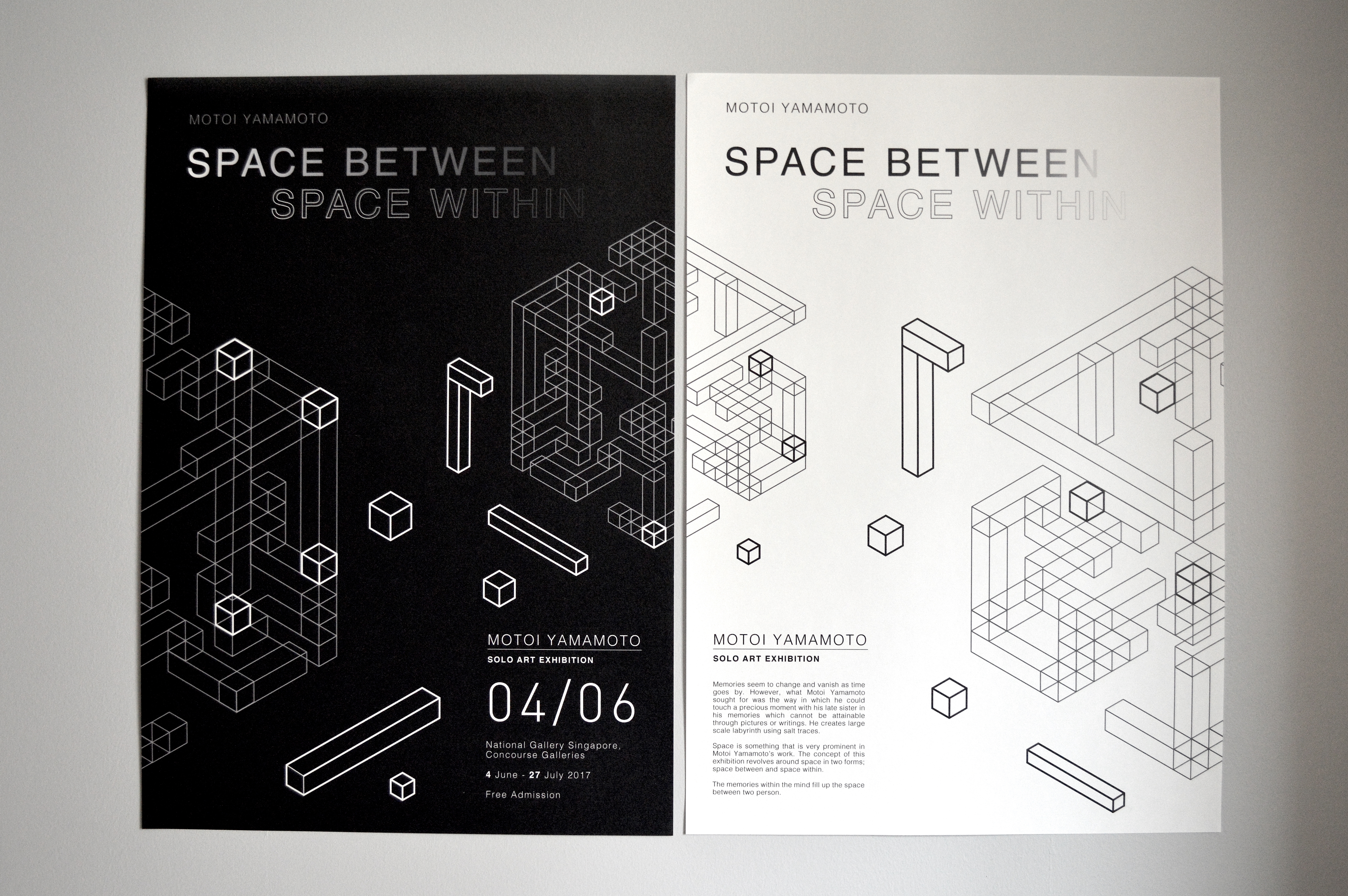
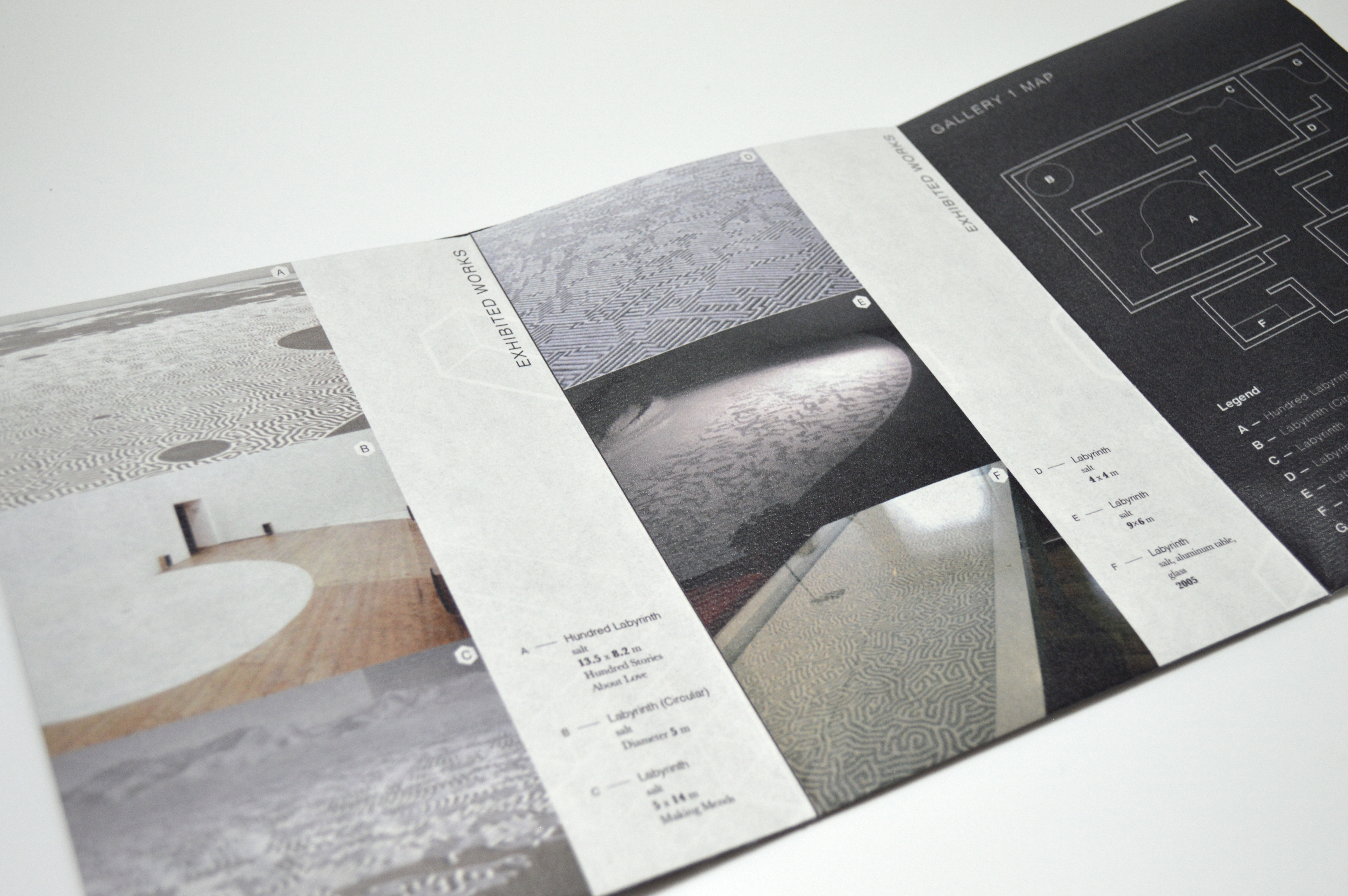
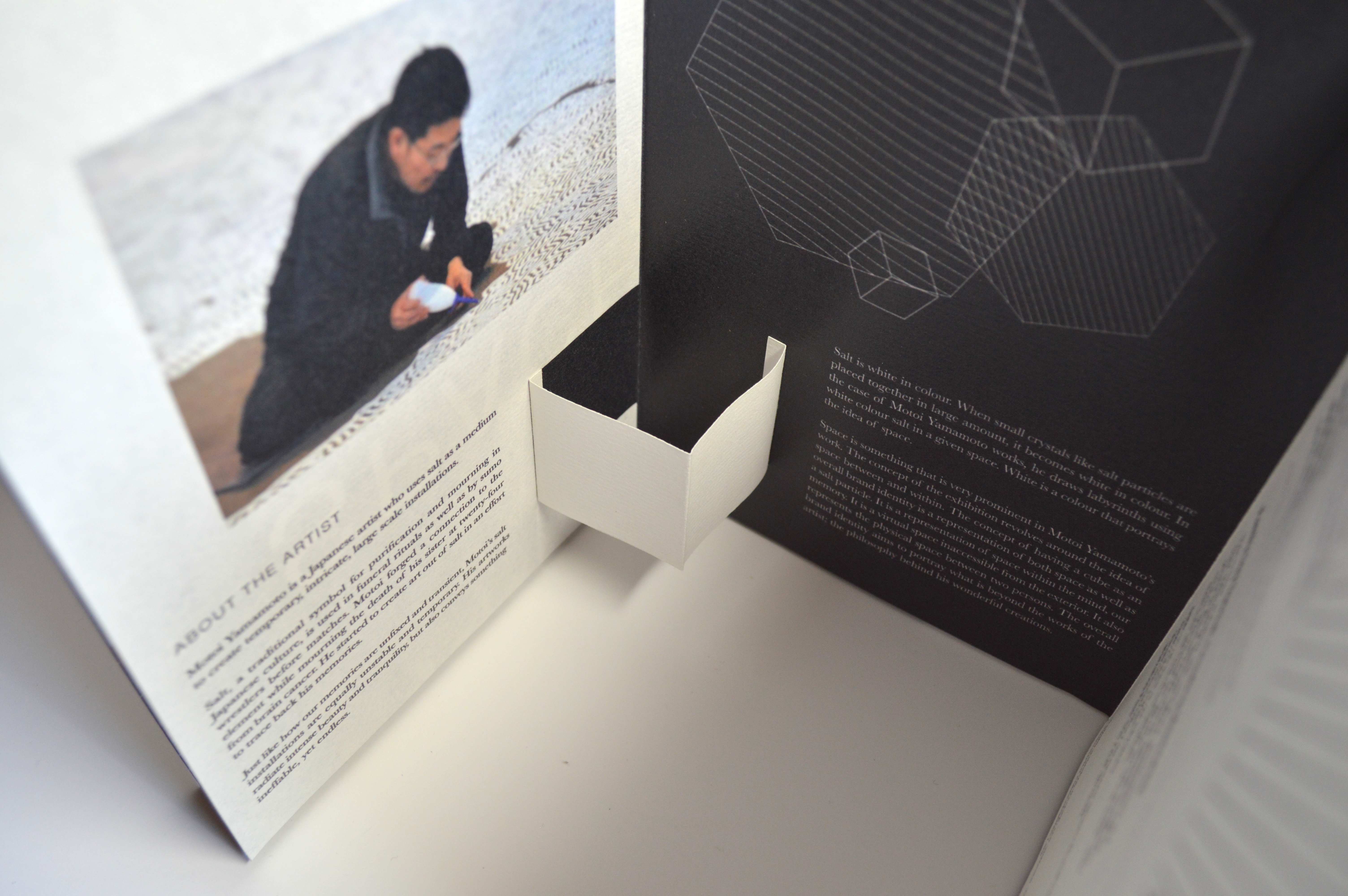
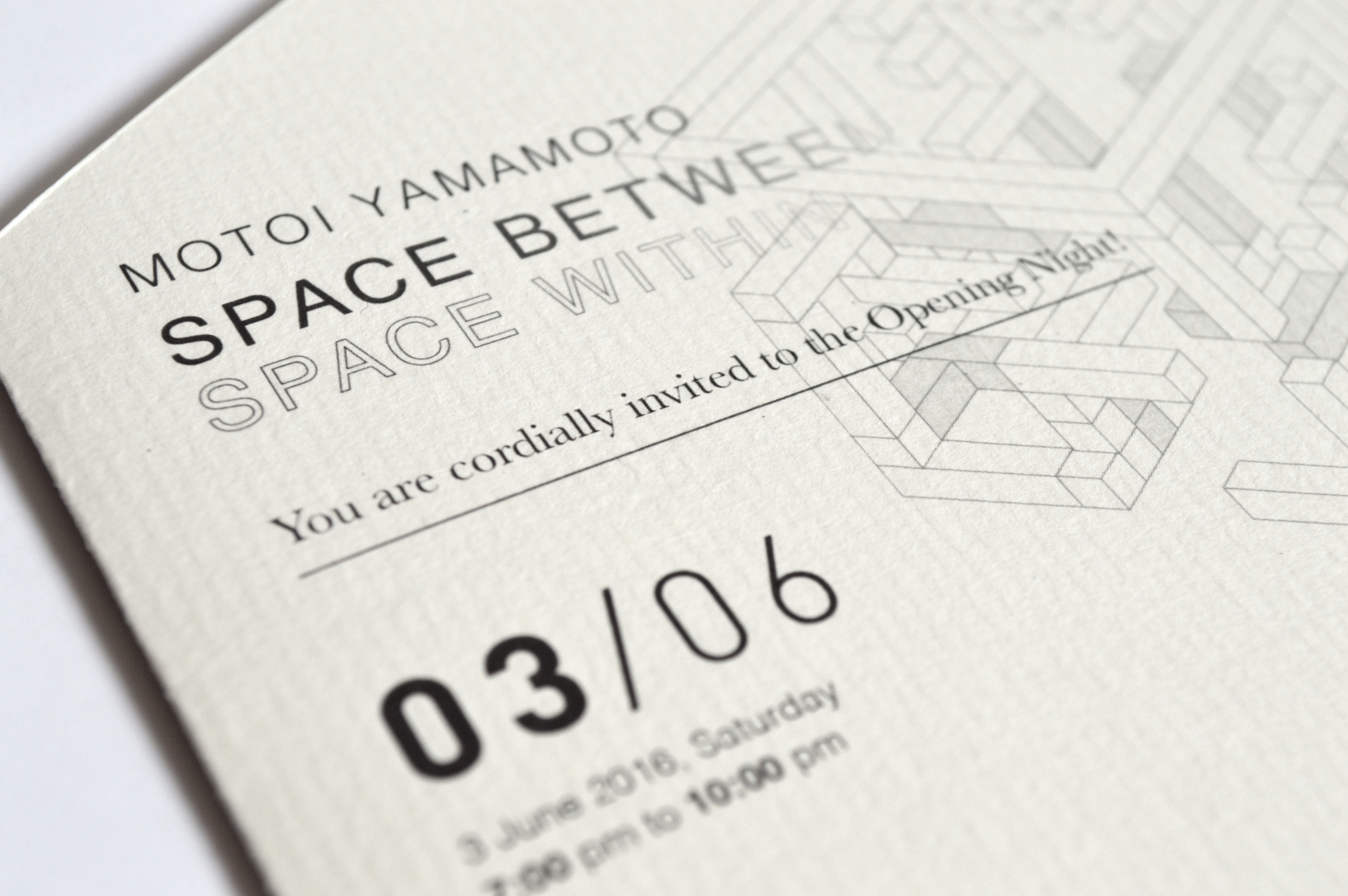
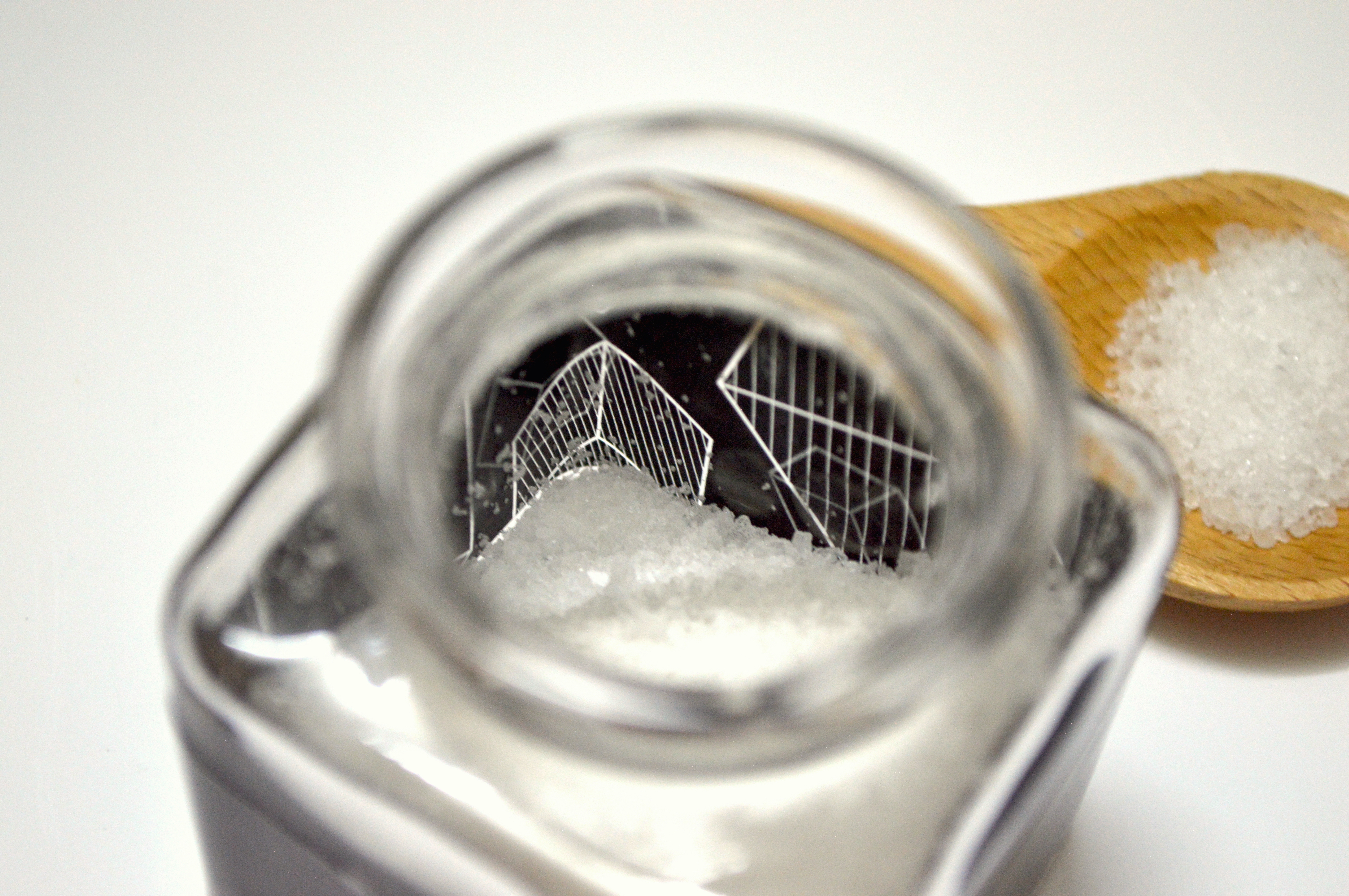
The exhibition branding was done based on Motoi Yamamoto, a Japanese artist who uses salt to create large scale installations. He forged a connection with the element while mourning for the death of his sister and started creating art out of salt in an effort to trace back his memories.

ART DIRECTION
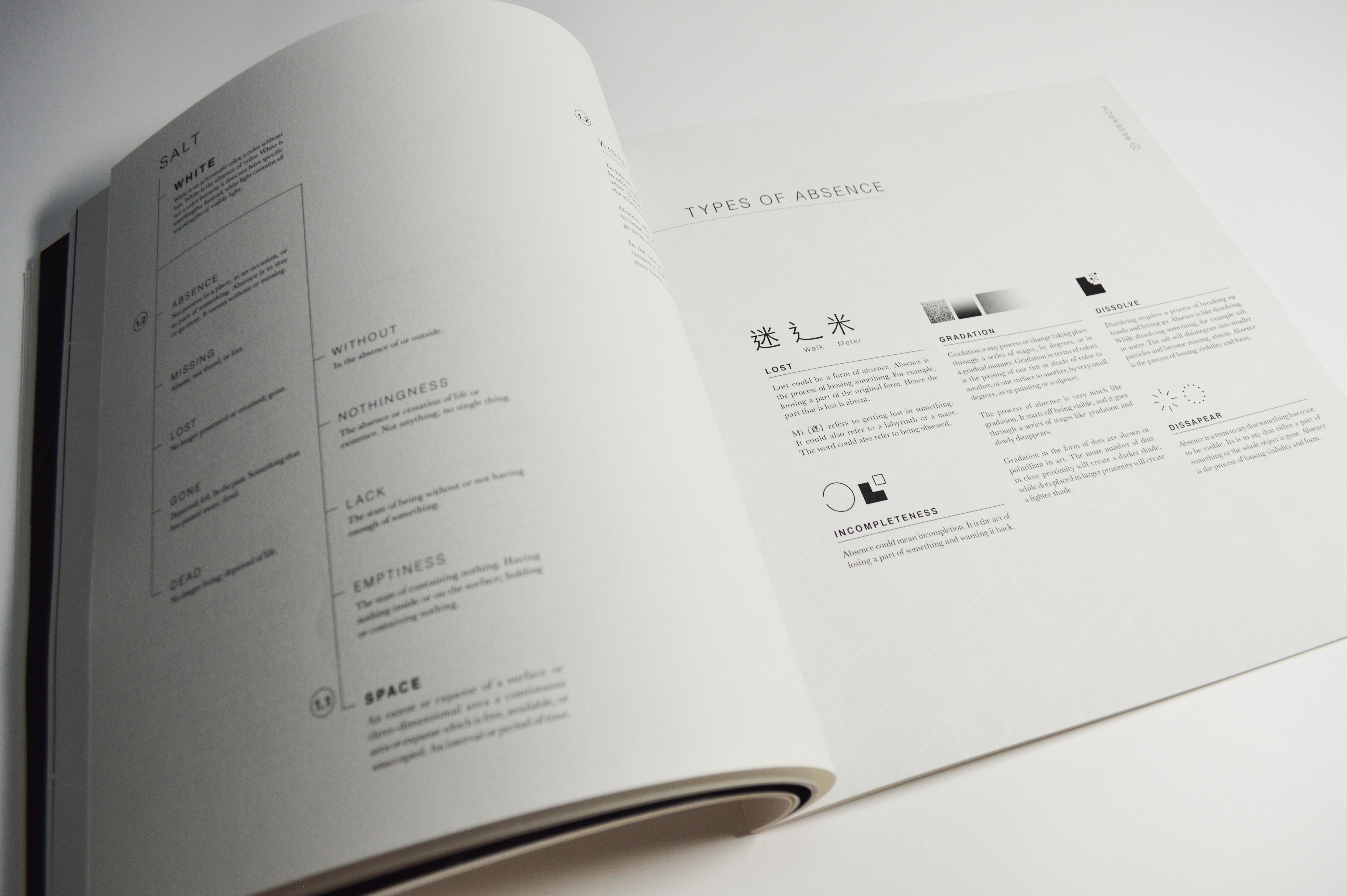
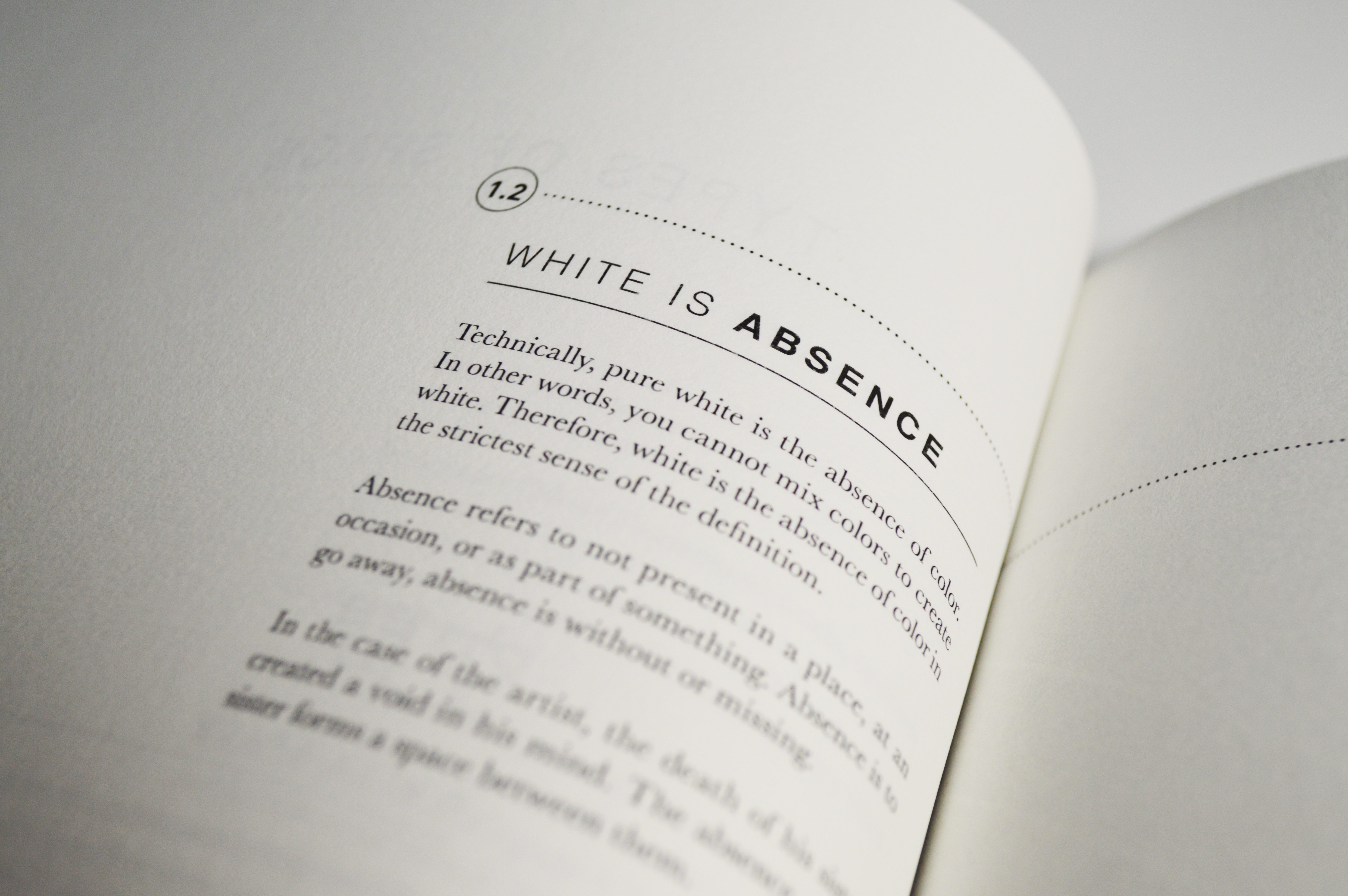
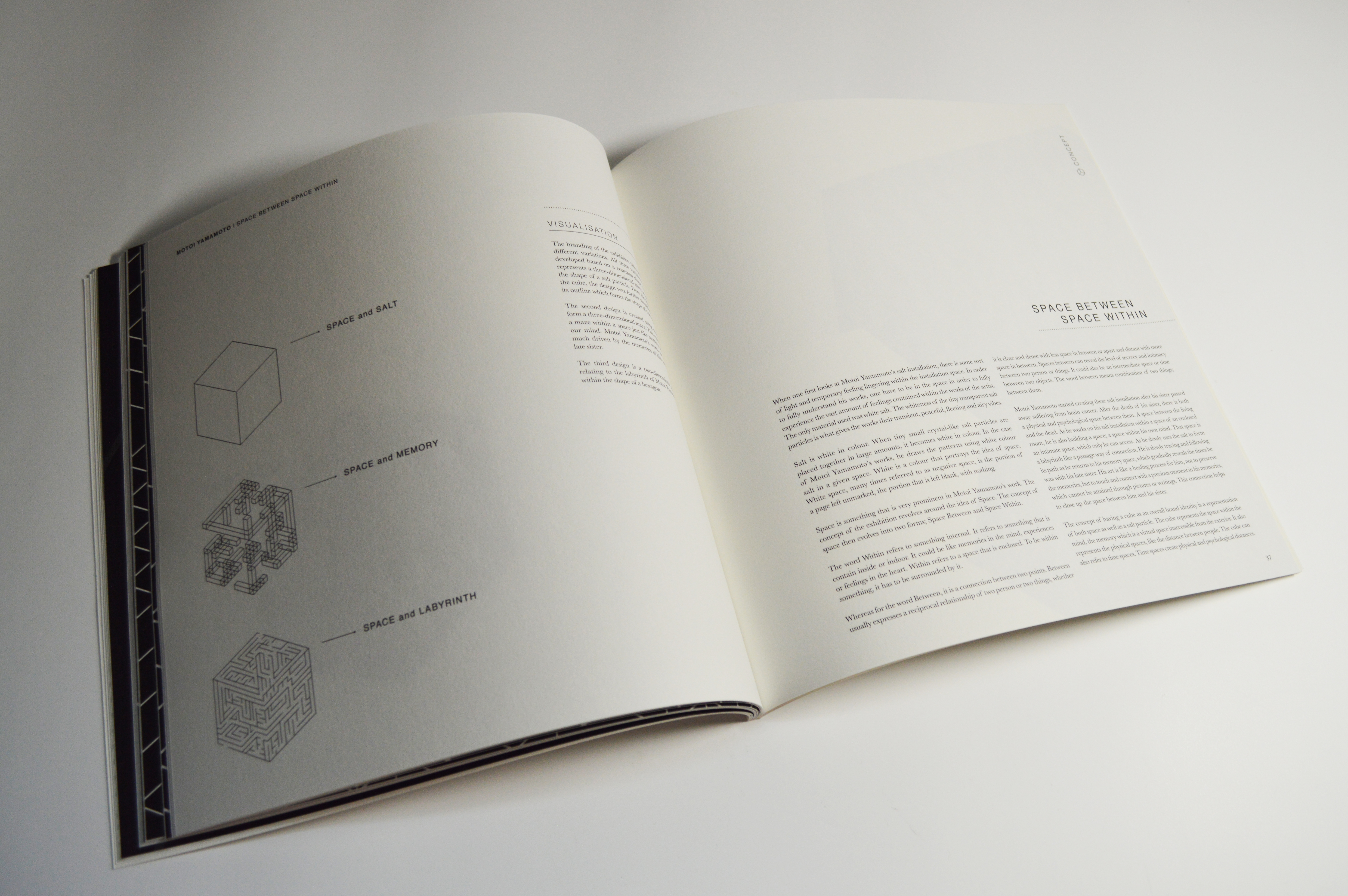
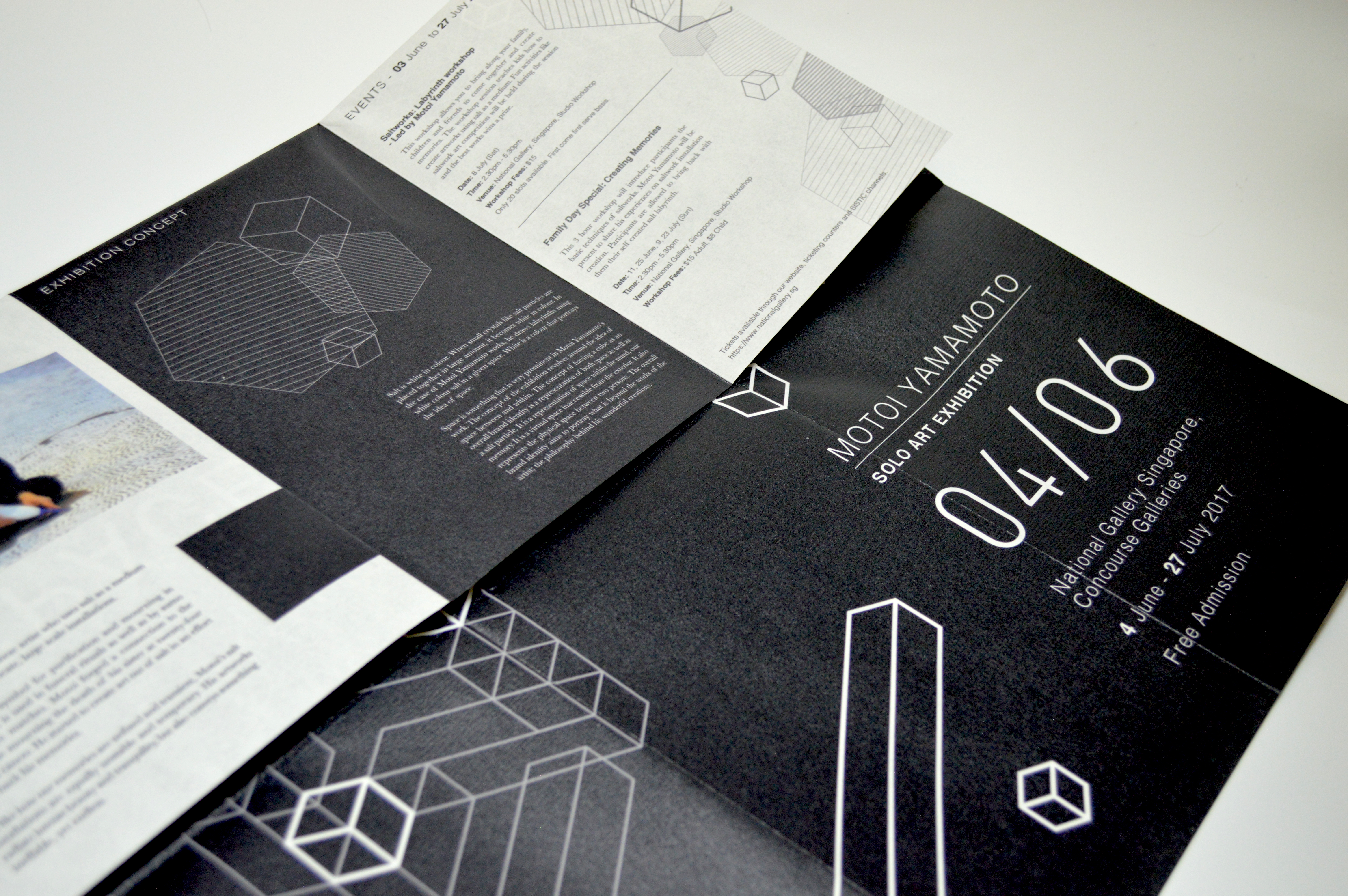
The concept of the exhibition revolves around the idea of Space. Space Within represents something internal like the memories of a person. It could also represent a space indoor. Space Between symbolises to the connection between two person; the intimacy of a relationship. There is a physical and psychological space between the living and the dead. As the artist uses salt to form a labyrinth within a space of an enclosed room, he is following its path, returning to his memory, a space within his mind which connects and close up the space between him and his sister.
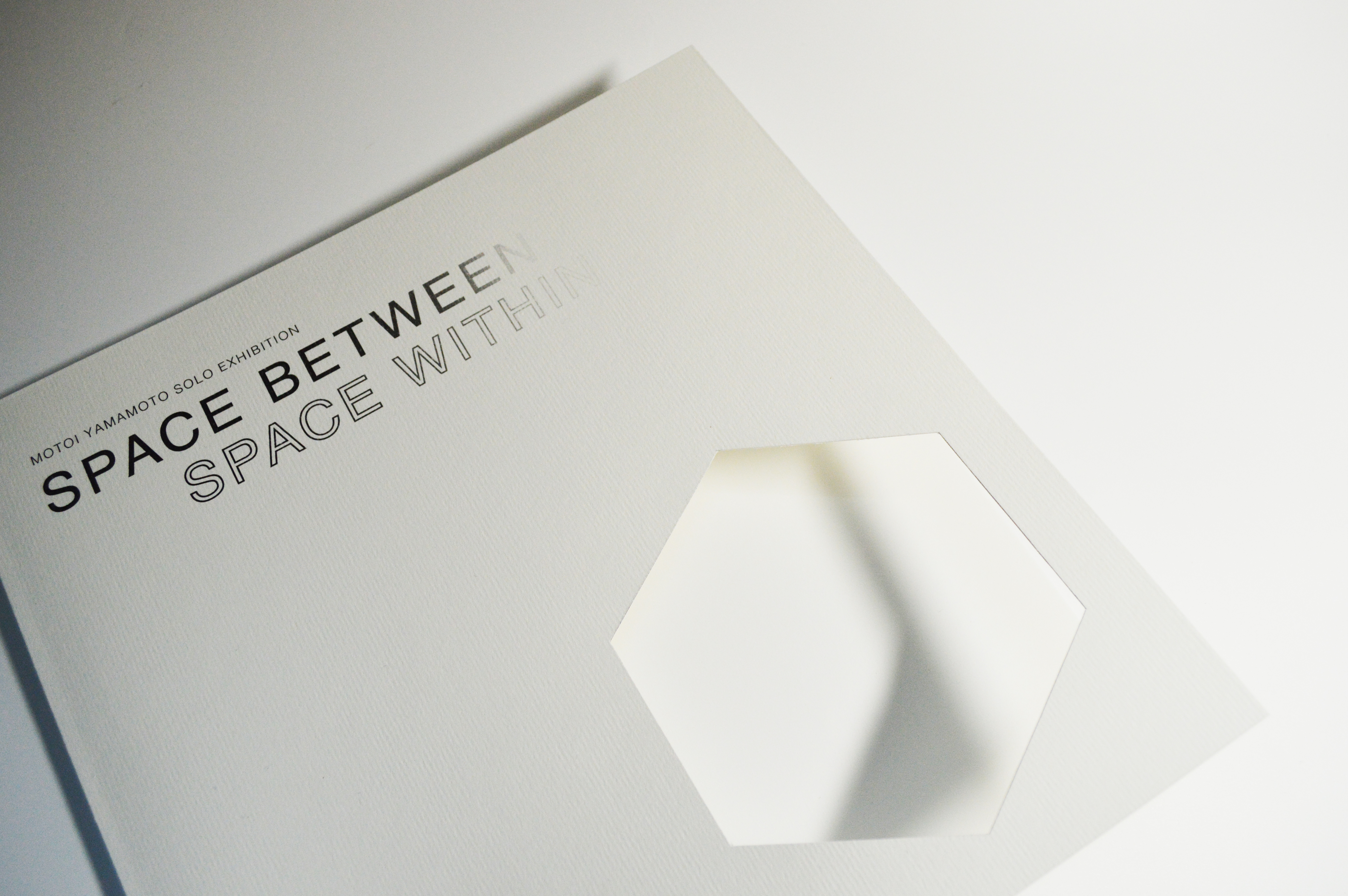
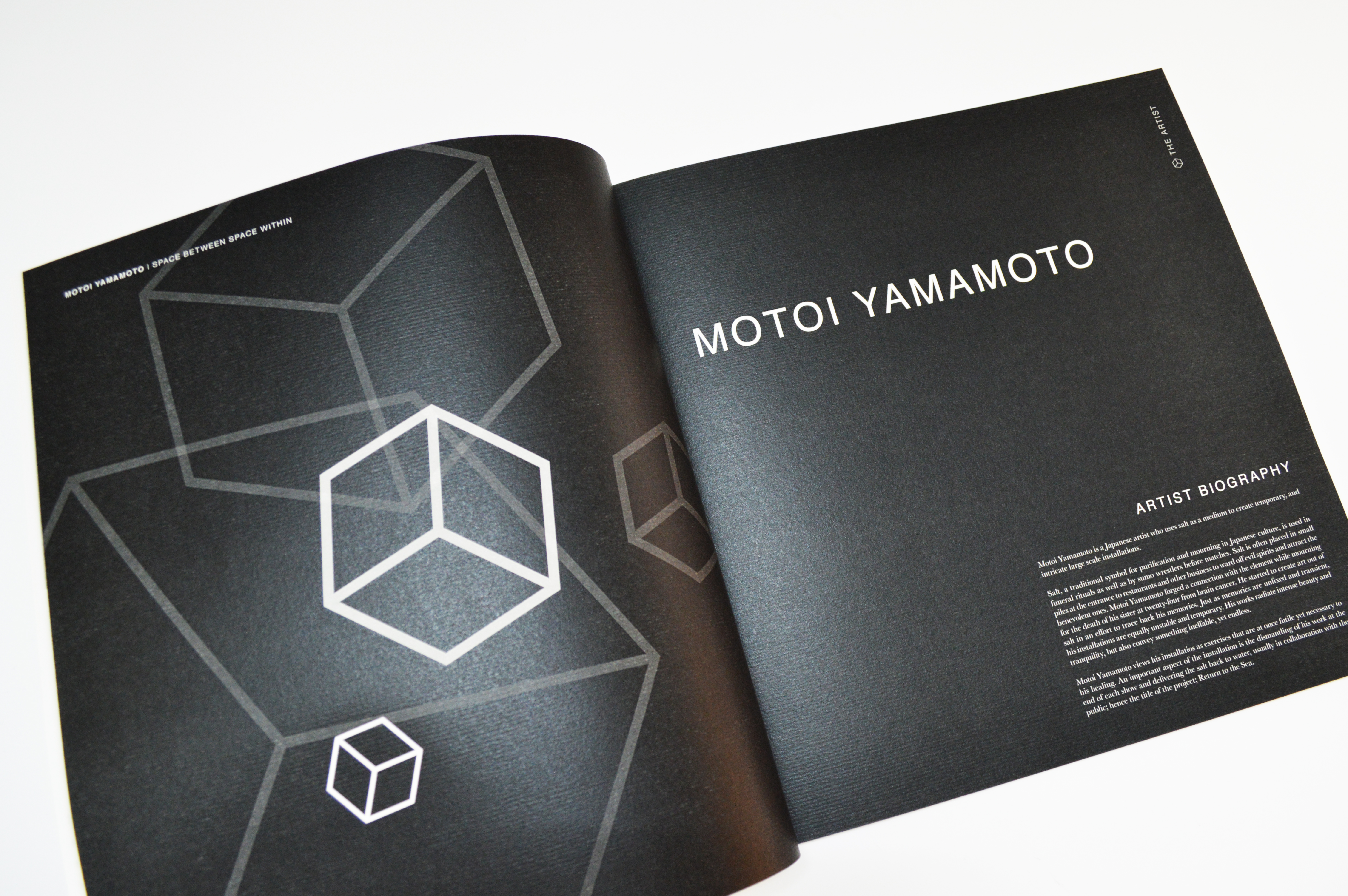
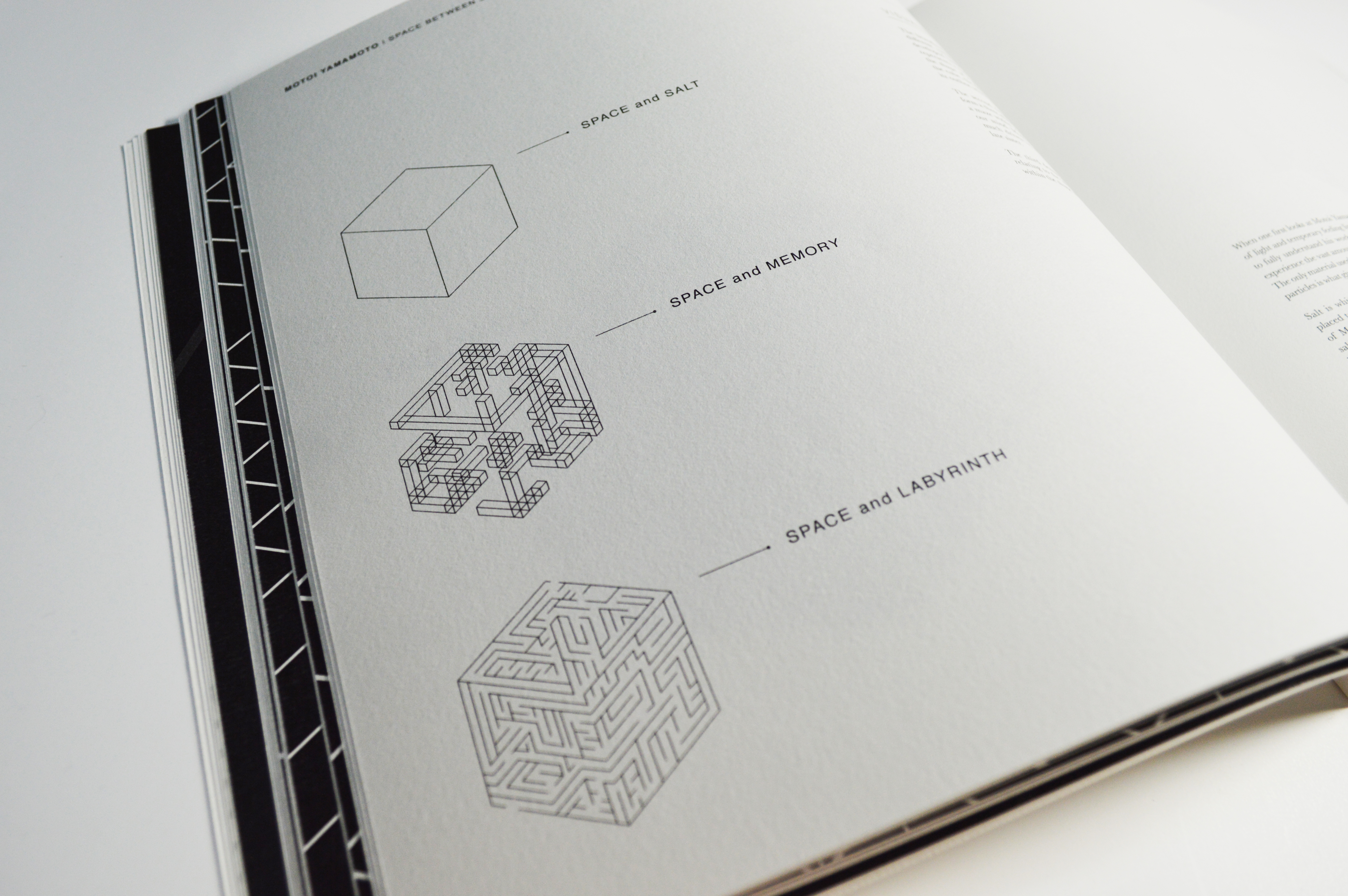
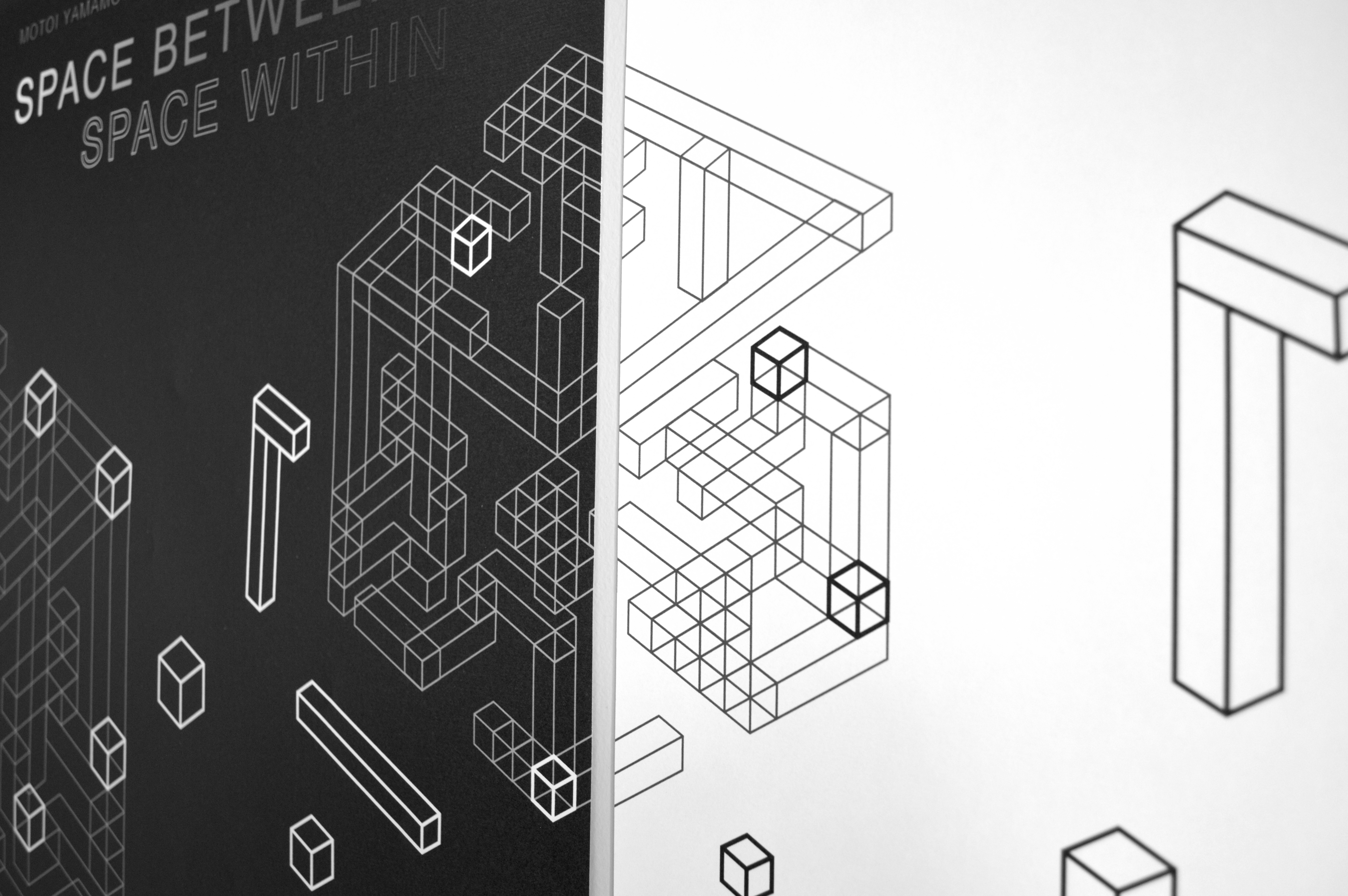
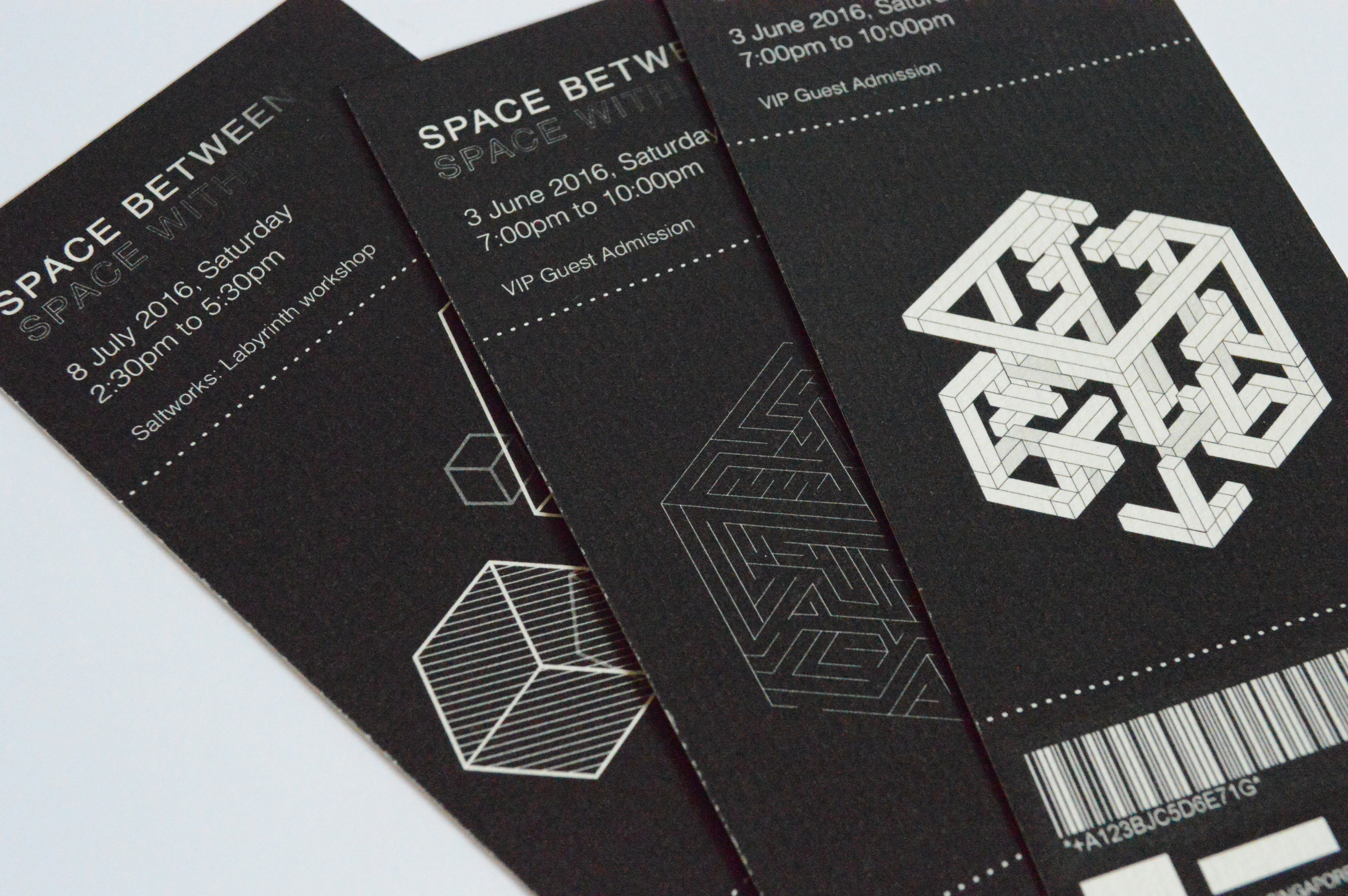
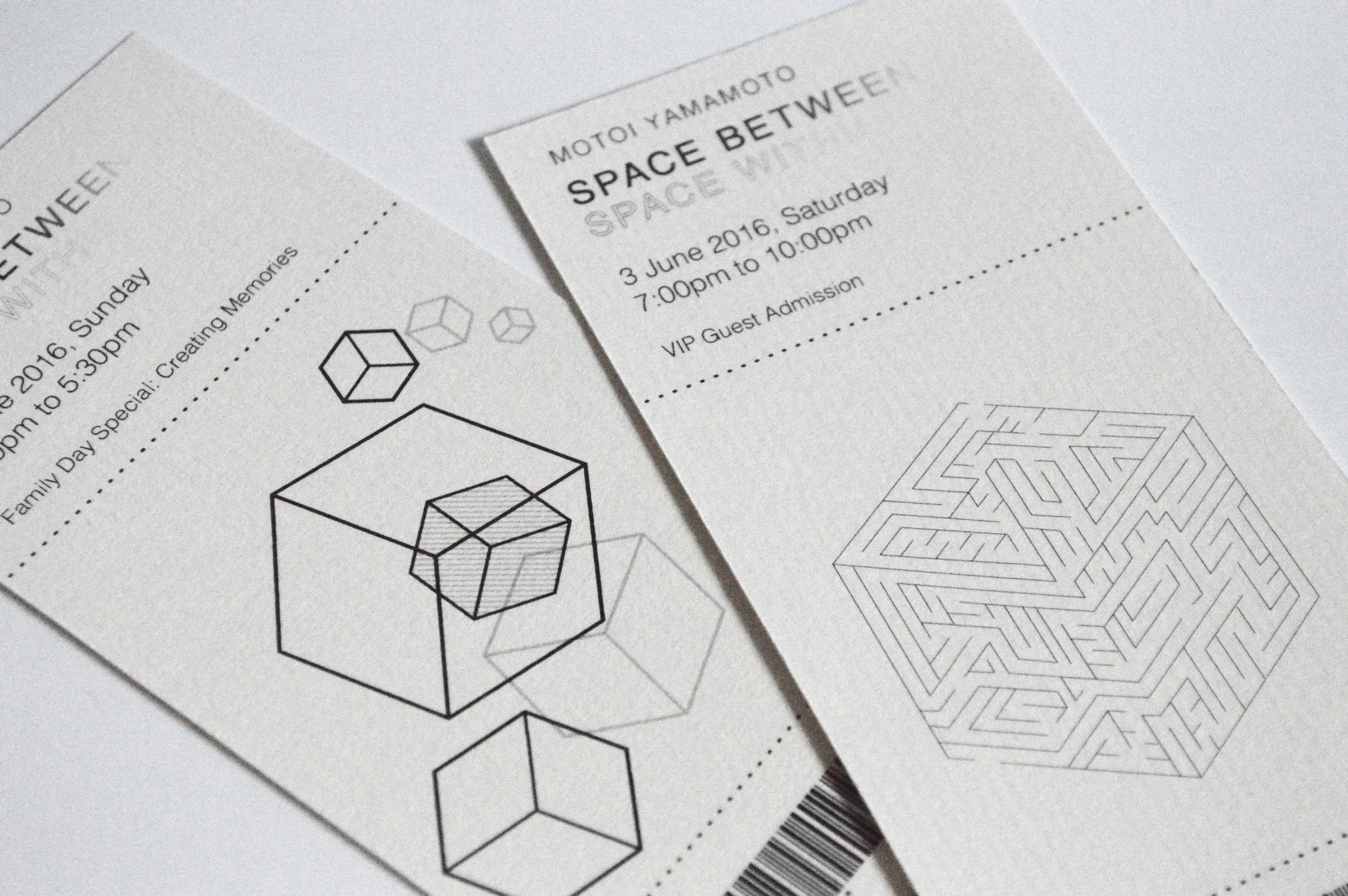
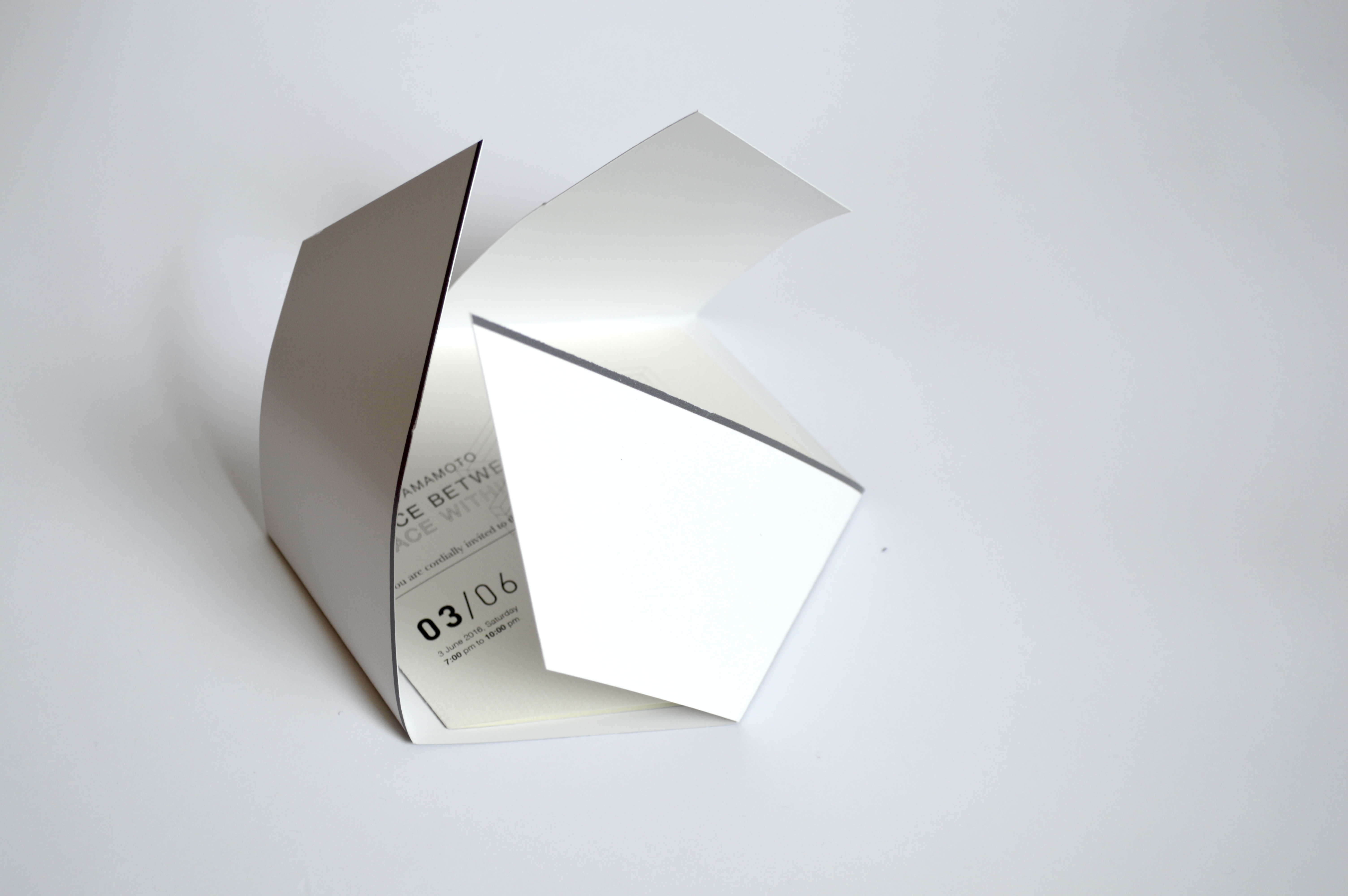
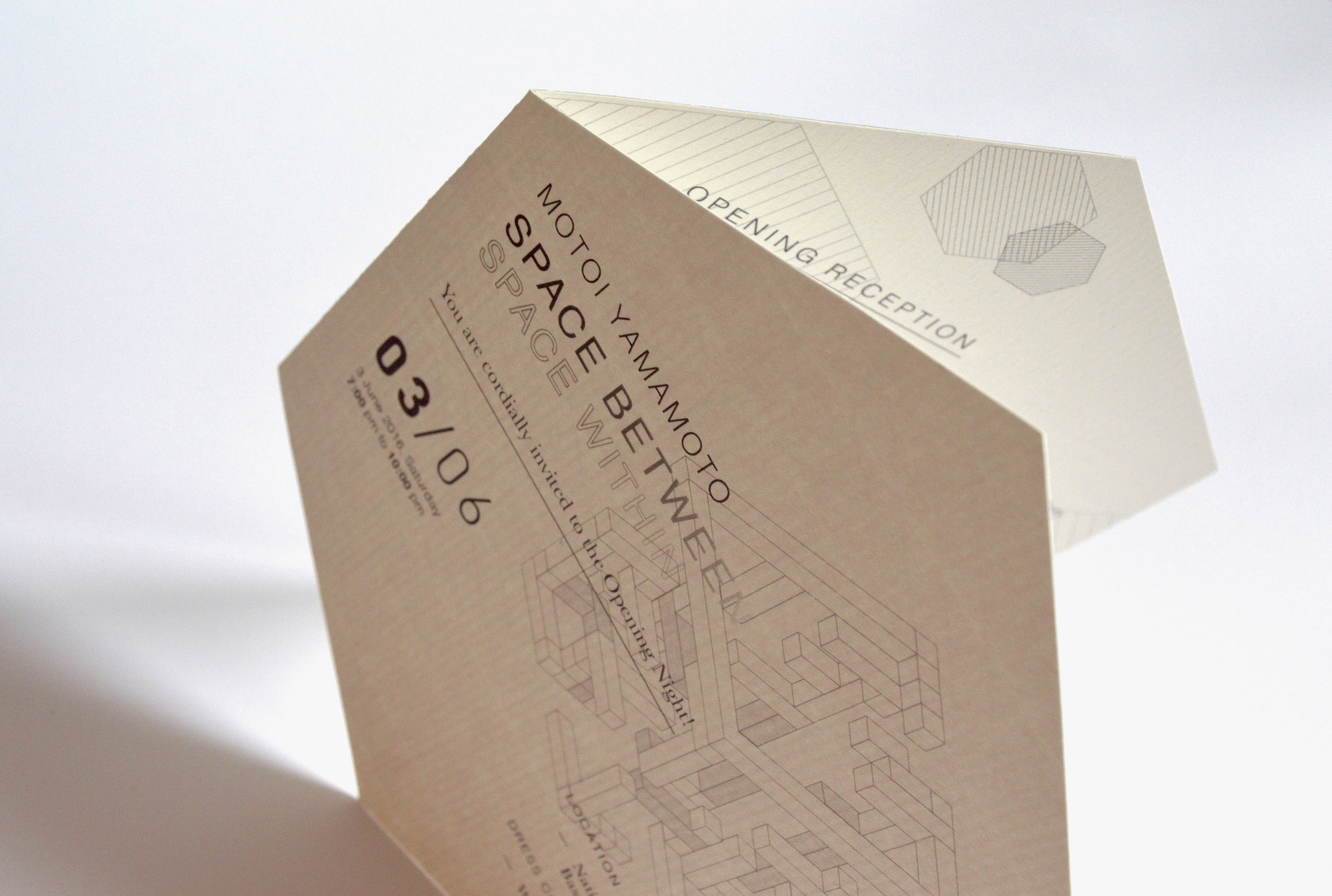
The branding concept was based on 3 words: Space, Memory and Labyrinth. The cube represents a three-dimensional space as well as the shape of a salt particle. The design was further simplified into its outline which forms the shape of a hexagon which forms a labyrinth similar to the installation of the artist.
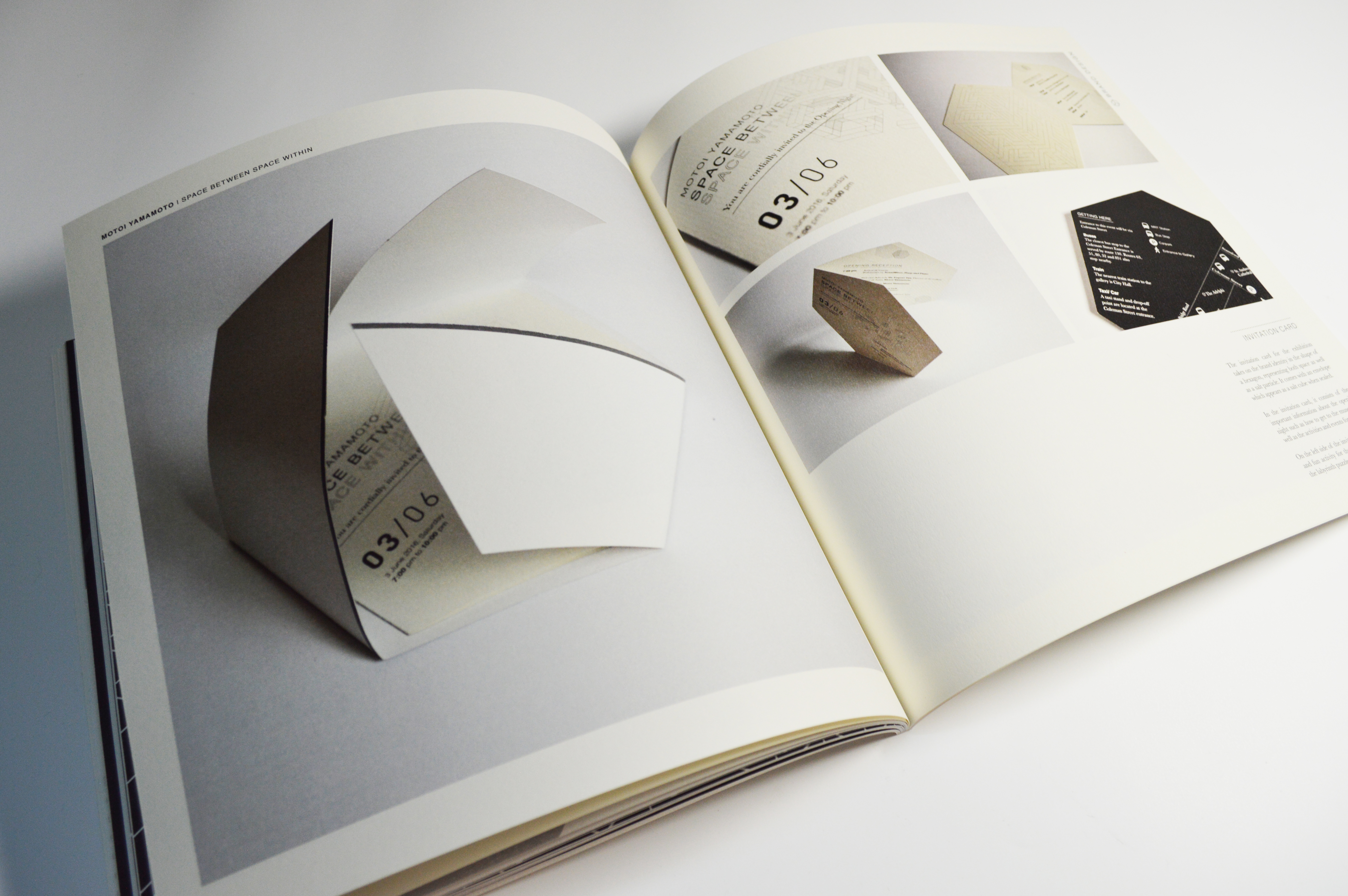
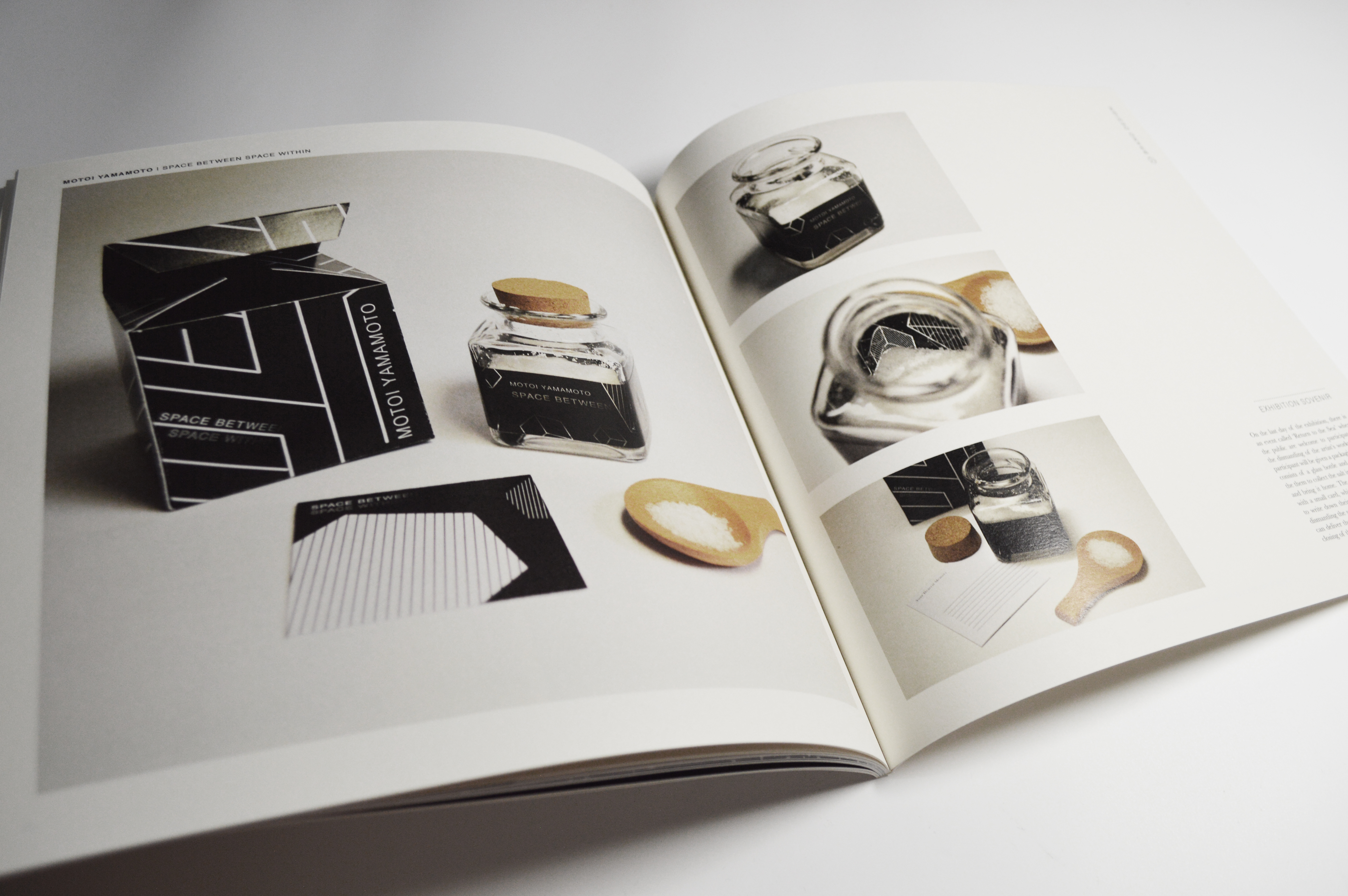
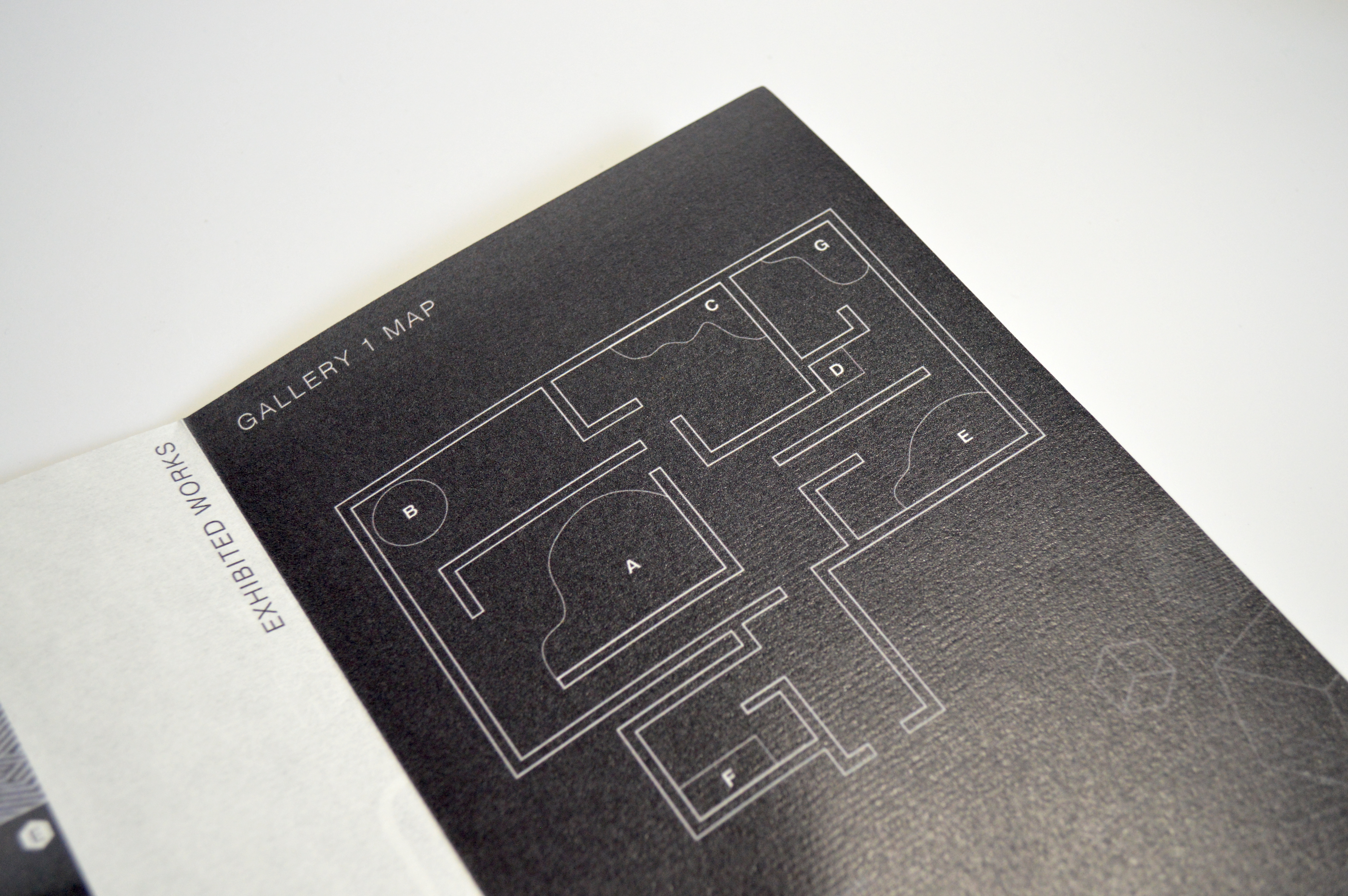
Exhibition Branding - Collaterals: Poster, Brochure Guide, Ticket, Direct Mail, Packaging, Crew tag.


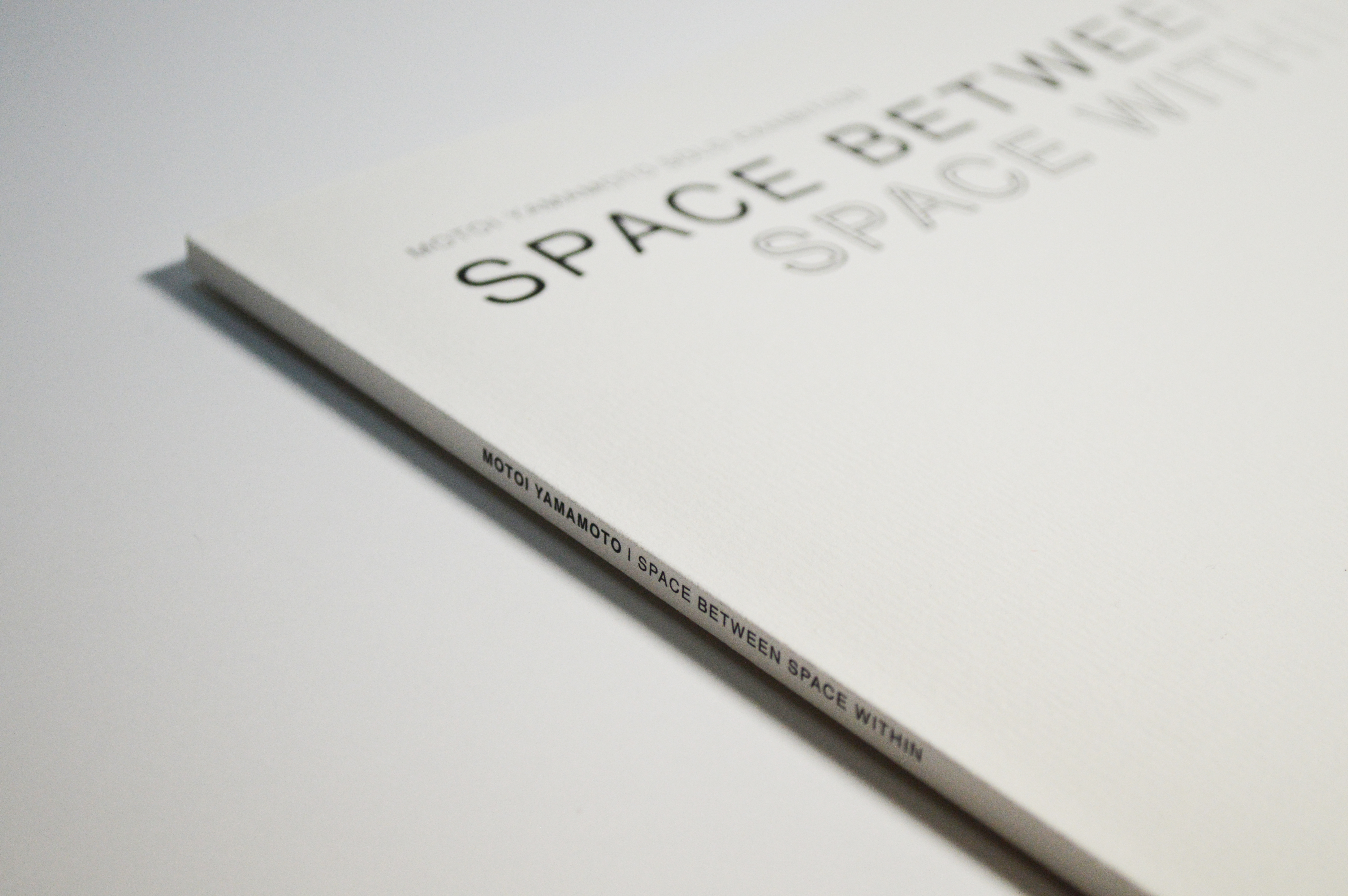
Exhibition Catalogue: